
The Ultimate Guide to Choosing the Right Paint Color for Your Home
When it comes to making your home feel like a true reflection of your style, few decisions are as impactful as choosing the right paint color. Whether you want a calming bedroom, an energizing office, or a welcoming living room, color plays a key role in setting the tone for each space. This guide will walk you through the process of selecting the perfect paint color, with tips and tricks to help make your decision easier and more enjoyable.
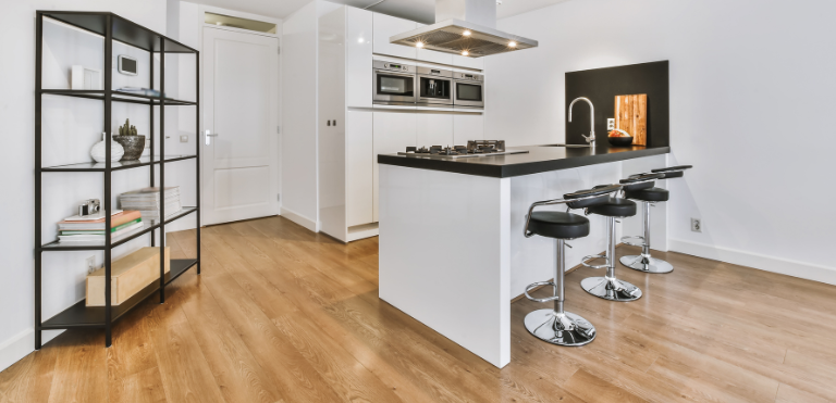
Paint & Plank can help find the best pro with the best deal!
Step 1: Understand Color Psychology
Color has the power to influence mood and behavior, so consider the purpose of each room as you make your color choices:
- Bedrooms: Soft blues, greens, and lavenders are calming, making them ideal for creating a restful environment.
- Living Rooms: Warm neutrals like beige, taupe, and warm grays create a welcoming space that encourages relaxation.
- Kitchens and Dining Areas: Yellow, red, and orange can stimulate appetite and conversation, adding energy to these spaces.
- Home Offices: Light blues and greens foster concentration and focus, while lighter grays bring calm without distraction.
Each color has unique emotional qualities, so think about how you want to feel in each room and choose accordingly.
Step 2: Use the Color Wheel as Your Guide
If you’re not sure which colors complement each other, a color wheel can help you explore harmonious color combinations:
- Monochromatic schemes (varying shades of the same color) create a sophisticated and calm atmosphere.
- Analogous schemes (colors next to each other on the color wheel, like blue and green) bring a cohesive, serene look.
- Complementary schemes (colors opposite each other, like blue and orange) add vibrancy and a touch of energy to a space.
The color wheel can help you visualize how different hues might work together in your room, balancing color for a stylish result.
Step 3: Consider Lighting in Your Room
Natural and artificial lighting can dramatically change the appearance of a paint color:
- Natural Light: Rooms with plenty of natural light allow paint colors to appear true to their shade, but pay attention to which direction your windows face.
- North-facing windows may cast cooler, bluer light, so warmer colors may balance out the space.
- South-facing windows offer warm light, which can enhance warmer tones but may wash out cooler hues.
- Artificial Light: The color temperature of your bulbs also matters.
- Warm bulbs (yellow or soft white) can intensify warm colors, giving a cozy, inviting feel.
- Cool bulbs (cool white or daylight) can enhance blues, greens, and purples, making rooms feel more modern and spacious.
Try testing a few paint swatches on the wall, observing how they look at different times of day before making your final choice.
Step 4: Start with a Color You Love
Choosing a color you’re already drawn to can make the decision easier and give your home a personalized touch. If you’re inspired by a piece of artwork, a favorite rug, or even a fabric, you can use that color as the starting point and build a palette around it.
- Accent walls: Consider using a bold color from your inspiration piece on one wall to make a statement.
- Complementary neutrals: If you love a bright, bold color, balance it with neutrals that won’t overpower the room.
Starting with a color you already enjoy ensures the finished space will reflect your unique personality and taste.
Step 5: Test Before You Commit
Many paint brands offer sample sizes, and it’s a great idea to test a few shades on your walls before you commit. Paint small swatches in different parts of the room so you can see how each color looks under various lighting conditions and at different times of day. If you’re unsure, here are some testing tips:
- Use a neutral primer if your wall color is drastically different from the sample you’re testing.
- Observe throughout the day: Paint color will appear different from morning to night due to changing light.
- Try multiple colors: Test two or three similar shades to see which resonates best.
Testing takes the guesswork out of your decision and ensures you’ll be happy with the final result.
Step 6: Keep Room Size and Function in Mind
Certain colors can visually alter a room’s size and make it feel larger or more intimate:
- Small spaces: Light colors like pale blues, soft grays, and creamy whites can make a small room feel more open.
- Large spaces: Darker shades can bring warmth and make expansive rooms feel cozy and inviting.
Also, think about the function of the room. High-traffic areas like kitchens and entryways may benefit from durable, washable paint finishes in colors that won’t show dirt or scuffs easily.
Step 7: Choose the Right Finish
Paint finishes can change the way a color appears and impact maintenance:
- Flat/Matte: Ideal for low-traffic areas like bedrooms, these finishes are non-reflective and great at concealing imperfections.
- Eggshell/Satin: These finishes offer a slight sheen, making them suitable for living rooms, dining rooms, and hallways where a touch of elegance is desired.
- Semi-Gloss/Gloss: Highly reflective and easy to clean, these finishes are excellent for kitchens, bathrooms, and trim.
Choosing the right finish helps the paint color shine in the best way for each room’s needs and function.
Final Thoughts
Choosing a paint color doesn’t have to be overwhelming. By considering color psychology, lighting, and testing samples, you can confidently pick shades that will make your home feel exactly how you want it to. Remember, your color choice is a reflection of your style—embrace the process, and enjoy transforming your space into a place you truly love.